The concept of portraiture is an intriguing one in art jewelry. From allusions to historical references to the modern “selfie,” the range of interpretations it lends itself to is boundless. Tinsel Gallery, in Johannesburg, South Africa, is currently showing the group show Portrait. In this interview, I talk with one of the participants, Carine Terreblanche, an art jeweler and educator, about her work, the concept of “portrait,” and the art jewelry scene in Cape Town.
Jessica Hughes: How did you first get involved in art jewelry?
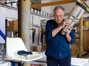
Carine Terreblanche: I did art as a school subject and always knew I wanted to study some form of design. After secondary school, I studied jewelry design at the University of Stellenbosch and obtained a BA visual arts degree in 1991. The school was influenced by the philosophy and objectives of the Bauhaus movement (which had shaped the thinking and teaching of the inaugural German staff members). A strong emphasis was thus placed on the relationship and interaction between fine and applied arts.
I studied under a German lecturer, Dieter Dill, and the course was focused on training students to become goldsmiths, art jewelers, and/or designers within the broader visual art environment. We learned about the art jewelry movement, but we were so far away and isolated (pre-Internet days) that my undergraduate training and understanding of art jewelry was limited to a modernist approach. It was only when I attended the Gerrit Rietveld Academie in Amsterdam in 1994 as part of my MA and studied under Ruudt Peters and Joke Brakman that I came into contact with art jewelry as we know it today. Here I learned how to conceptualize ideas, and my understanding of my discipline and art practice changed. My new understanding of art jewelry came from influential ideas in the postmodern movement. Next year it will be 30 years since I first started training and studying in the field of jewelry and design.
As head of the Creative Jewellery and Metal Design Division of the University of Stellenbosch, how has being an educator and in the higher education environment affected your own work?
Carine Terreblanche: When I first started teaching in 1995, my old print-making lecturer, Lyn Smuts, told me it is when you teach that you really learn. I soon realized the truth of her words. In the field of visual arts and creative processes, all actions cannot be explained or put into words, but that is exactly what you’re required to do when you teach. To find the appropriate words to guide and nudge students through a design process is a challenge and also a constant leaning process, as each student’s approach is different. In this way, teaching compels you to start looking at your own process, ideas, and outcomes more critically. This can, at times, lead to crippling self-doubt, but it also stimulates growth and new approaches to your own work.

Can you tell us a little bit about the art jewelry scene in Cape Town?
Carine Terreblanche: There are many small independent art jewelers working in the Cape Town area. Unfortunately, the infrastructure for showing art jewelry in South Africa is limited, and the only gallery that shows art jewelry in a committed and active way is the Tinsel Gallery in Johannesburg. The online showcase of Carla Maxine Kruger features some of the jewelers in the Cape Town area. It is a very good example of the quality of work produced in the art jewelry scene in South Africa. The aims of Tinsel Gallery and of Kruger’s showcase are to promote artists who work within the more conceptually challenging context of art jewelry and to create awareness for this form of artistic expression in South Africa and abroad. This is not an easy task, and I am very grateful for what they are doing.

How did you get involved in the Portrait show at Tinsel Gallery? Had you worked with them before?
Carine Terreblanche: I have a long relationship with the owners of Tinsel, Geraldine Fenn and Eric Loubser. Eric is one of my ex-students and Geraldine has done part-time teaching and external marking in our Jewellery Division over the last few years. I see them as my colleagues in the north of the country, and I really respect their individual talents and expertise. The two of them form the perfect complementary match to run a contemporary jewelry gallery/business. For several consecutive years, Tinsel has been inviting South African art jewelers to participate in a group exhibition around a particular theme or concept in October/November. It has become a bit of an institution that we as jewelers look forward to. These art jewelry group shows are a wonderful opportunity to not only make interesting work, but to educate students and the public about the art jewelry movement, where notions of beauty and jewelry as status symbols and bling are interrogated, often in a playful manner.
 Midlife Crisis Harley, 2016, brooch, silver, paint, 45 x 38 x 9 mm; (center) 'Fro Forward, 2016, brooch, silver, wood, paint, 53 x 38 x 11 mm; (right) Philanderer, 2016, brooch, silver, paint, 46 x 39 x 10 mm, photo: Sarah de Pina")
Looking at the title of some of your pieces for the show—Midlife Crisis Harley, ‘Fro Forward, Philanderer—makes me wonder if these are personifications of actual people—or perhaps a caricature of a very specific personality trait?
Carine Terreblanche: My series of portraits was inspired by a passage in the novel The Course of Love, by Alain de Botton, which I was reading at the time I started designing for the portrait exhibition. In the book, the mother (Mrs. McLelland) of the main character, Kirsten, has the following opinion about the man her daughter was dating:
“Having no say does not mean, however, that Mrs. McLelland has no questions. She wonders if Rabih will prove to be a philanderer or a spendthrift, a weakling or a drunk, a bore or the sort to resolve an argument with a little force—and she is curious because she knows, better than most, that there is no one more likely to destroy us than the person we marry.”
The paragraph immediately spoke to personal experiences/memories and my initial idea was to make a series of male caricatures with specific personality traits and/or personality disorders. During the realization process my series grew past male caricatures.
You seem to use color in a very direct and deliberate way. Is there a meaning behind the bold red color incorporated into these pieces?
Carine Terreblanche: Red has always been my default color. I design in black pen and ink, and this results in black and different shades of gray drawings. I will add small amounts of color to the drawings and red will always be my first choice. The color choice is therefore more part of a subconscious choice and taste rather than a conscious decision. After designing, I allow myself to be led by my drawings in order to turn two-dimensional drawings into three-dimensional objects, but in this case the red from my design drawings was simply perfect for the mouths of ‘Fro Forward and Philanderer. With Midlife Crisis Harley, the clichéd red bike or compensatory sports car immediately came to mind.

The concept of “portrait,” although one of the oldest themes in art history, has of late taken on a very modern “selfie” translation. Your work seems to hark back to a more primative take. Was this an intentional comment on the modern portrait trend?
Carine Terreblanche: Fortunately (or unfortunately?), I am not from the selfie generation. I find the younger generation, with the “selfie” as their ever-evolving personal identity façade, both alien and fascinating. I’d like to explore the selfie phenomenon in a future series of portraits.
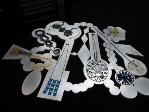
My current series of portraits was inspired by a paragraph I read in De Botton’s latest novel, as explained before. My approach/take is definitely more “primitive” and maybe even traditional, probably as a result of my personal field of reference and visual training. In my student years, my close friends studied illustration and we all used to read a lot of comic books and graphic novels. My design and drawing style was definitely influenced by this period. In my design/drawing process, the two-dimensional investigation of forms is guided by a meditative and subconscious working process. My wooden and metal forms derive from drawings in my design sketch books. The drawings are made by a process that could be compared to doodling, a subconscious process where I do not try to control my drawing process and its outcomes. When I follow this process, the individual designs/drawings always seem to be members of the same family. It is as if my subconscious has a set of signs or an alphabet with which it creates the obscure and slightly mysterious shapes of my thoughts.
 Geraldine Fenn, Untitled (Random Portrait), 2016, ring, silver, blue sapphires, 32 x 27 x 33 mm; (right) Liz Loubser, Mrs, 2016, pendant, silver, 18-karat yellow gold, pearl, tsavorite, turquoise, coral, 50 x 22 x 12 mm, photos: Sarah de Pina")
Portraiture—or at least representation of specific people—is also a staple of traditional jewelry (sentimental hair work, eye portraits). It has had sporadic popularity amongst contemporary jewelers (recently, for example, in the work of Noon Passama or Tore Svesson). Do you think this is a theme that should be more exploited?
Carine Terreblanche: Yes, I think it should be explored further, as portraiture has such a rich history in jewelry. The first thing that comes to mind is my mother’s cameo, but Victorian hair jewelry and eye portraits are even older, and I think all the historical examples offer a variety of conceptual possibilities and opportunities for interesting research.
Tore Svesson’s subtle dark faces in steel refer to cameos only in their size and the often oval format, but the meaning is more personal to the artist. The possibility to evoke new conversations around old iconic forms of portrait jewelry seem endless.
Are there any other projects you’re working on?
Carine Terreblanche: In fact, this exhibition inspired me to attempt a much larger series of portrait pieces in the same vein. I would like to extend the theme and series into wooden sculptural pieces. I had a big solo exhibition in 2013, Die Geraamtes van Drome/The Skeletons of Dreams, and all the new work I have made since then seems to be part of the same, bigger family or set of signs from my own organically growing design alphabet. Some of this work can be viewed here.
Have you read or seen anything of interest lately?
Carine Terreblanche: I love seeing how jewelry in conjunction with fashion defines the identity of characters and eras. In this respect, TV series like Downton Abbey, Game of Thrones, Peaky Blinders, and Miss Fisher’s Murder Mysteries did not only thrill me with their plot twists, but really enticed me with their sense of style and design.
While doodling designs this year, I found listening to new albums by Max Jury, Agnes Obel, Elza Soares, and Michael Kiwanuka very stimulating.
The prices in this show range from $65 to $2800.
, 2016, pendant, hand-carved highveld quartz, 18-karat yellow gold, oxidized silver, 58 x 36 x 24 mm (excluding chain), photo: Sarah de Pina")
INDEX IMAGE: Carine Terreblanche, ‘Fro Forward, 2016, brooch, silver, wood, paint, 53 x 38 x 11 mm, photo: Sarah de Pina