Susan Cummins: Jane, in the exhibition Out of the Blue, you asked the following artists to interpret the theme as it relates to the sea and sky:
Brooke Battles • Marilyn Brogan • Susan Chin • Petra Class • Jane Groover • Sydney Lynch • Wendy McAllister • Christina Seebold • Cindy Sumner • Myung Urso
Did you imagine this to be mainly about landscape or color?
Jane Groover: I initially thought that the work in Out of the Blue would be about both landscape and color, while acknowledging that blue certainly means different things to different people. It felt like an intriguing title because of its ambiguity. And since it is common knowledge that the majority of people claim blue as their favorite color, I imagined the work for this exhibition would probably focus primarily on color.

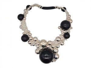
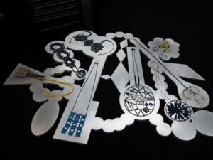
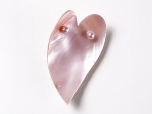
Jane Groover: Although we began with the idea of landscape and color, we opened the door to the unexpected when we chose the title Out of the Blue. We knew that artists might interpret this phrase in a very personal way and we were curious to see the resulting work. With few exceptions, however, the work in this exhibition focused on the color blue. Petra Class and Sydney Lynch use spectacular gems of lapis lazuli and aquamarine, and Brooke Battles and Wendy McAllister both fabricate work with blue enamel. Myung Urso’s work includes blue fabric, thread, and blue rubber bands, and Christina Seebold’s work incorporates blue pearls and abalone shell. Marilyn Brogan uses red coral and pearls, referencing Out of the Blue as it relates to the sea. The most unusual interpretation of the title came from Cindy Sumner, whose mysterious stacks of rings in wood, acrylic, and mixed media images are truly out of the blue, unexpected and delightful.
I asked the following artists who participated in the show these questions: What did the theme of Out of the Blue mean to you? How did you approach your work with this idea in mind?

So, since I am a goldsmith and jeweler, I work with blue stones and lately more and more with lapis lazuli, the rock of the ancients and of Yves Klein. I grind it and slice it and make patterns with it and mosaics. I am trying to get to the bottom of the color, but I get nowhere, since every slice of a single big rock reveals a different shade of ultramarine.
I collect its dust. I set it in gold because it feels so precious. I enjoy the meditative quality of being immersed and surrounded by it.
Frankly, the theme Out of the Blue was not a reason for making the work. The work was there first. I have been addicted to lapis lazuli for a long while now …


The composition Blue Suds is an example where wood material was adopted as an extension of fiber applications with intertwined silk cord. To be led towards unexpected consequences is a most curious way to create works of art. This happens when I release and open myself to be spontaneous rather than planning and manipulating in advance.

I began wearing blue, painting my toenails bright blue, and inevitably using more and more blue stones in my jewelry. The stones I chose for Out of the Blue include some less typical materials, which I find beautiful and fascinating in a magnetic way.
I’ve lived in Colorado, and then Nebraska, all of my adult life, and for decades my vista has been an enormous blue and changing sky. I design intuitively without a lot of advance conceptualizing. As Georgia O’Keeffe famously said, “I found I could say things with color and shapes that I couldn’t say any other way—things I had no words for.” For me, color is a feeling, and in this instance, blue is doing the talking.