Amelia Toelke: You have a BFA in jewelry from RISD, but have been researching and writing extensively about contemporary jewelry as well as curating exhibitions for a number of years. How and when did you first begin to participate in the field in this critical manner? How do you balance making with writing and curating? Do you consider these aspects to be an integral part of your broader art practice?
Kellie Riggs: My entry into the contemporary jewelry world started in 2011–2012, when I was on a Fulbright grant to Italy. At the time I was really interested in the Padovan goldsmiths—such as Babetto, Visintin, Pavan, and Marchetti—and wrote my research grant to revolve around them and to discuss their place in art history (rather than in a jewelry-related history), but that was rather lofty, as I’m not really an art historian. Meeting them all was really eye opening, however, and I began to expand my interests to a younger generation of contemporary jewelers, and the ways in which the field spoke about itself. I was particularly curious about language and how the ways we explained or defined contemporary jewelry might keep it relegated to a status inferior to art. I’m less interested in this now, but at the time I was obsessed with getting the world to realize jewelry was art, not really accepting the fact that many people had been trying to do that for decades already, and, in a way, had succeeded.
But I digress. So I went to Munich alone in 2012 and saw as much as I could and met many artists and spoke to them about their practices, saw the ways they were putting shows together, etc. I also traveled to Amsterdam that year, where I interviewed all the gallerists: Rob Koudijs, Paul Derrez, Monika Zampa (when Lois Smit was still open), and Marie-José van den Hout, at Marzee. I still have the recordings but never did anything public with them.
The day I was at Marzee, a friend of mine was interning there, and she told me that Susan Cummins would also be there that day, believe it or not. We were introduced. I think she had read the jewelry blog I started that year, Greater Than or Equal To (which I gave up a few years ago due to better writing gigs), and she asked if I might be interested in writing for AJF. I was, and began to do some interviews for them with galleries, and when Ben Lignel became editor I wrote some longer pieces, too. Besides Susan, whom I’m so grateful to for giving me my first shot, he was the one who made it clear I had a knack for writing and should cultivate my voice. He’s still my mentor in many ways. And so curating was just a natural next step.
I’m also a jeweler, though weirdly more of a traditional one (I have my own business, of sorts, where I work mostly on commission making hand-engraved signet rings), but over time I realized there were plenty of more talented people making amazing work and it was ok if my contribution to the field was through writing instead of making. I wanted to find a way to lift these artists up. Jewelry is such a hard medium, especially when it’s also art (or however you want to categorize it), so I found myself always wanting to create more space for it. I ended up meeting Marina from Current Obsession, and with them I got to write a lot of interesting things and edit the magazine for a few years—they really allowed me to go nuts—and it was with them that I also started curating, though it was always an interest and a natural next step to writing.
Most of my writing on jewelry was critical of the exhibition as a format for categorizing the field, so to then do it myself, to see if there was a better way, was really exciting. I view writing and curating as one and the same, actually. You can’t do one without the other, and the written word is so vital to elevating the work of makers, whether it’s complex, emotional, or just fun to wear and cool to look at. To answer the last part of this question, I would absolutely say curating is my art practice. I would be a lousy curator if I didn’t go to art school and didn’t first make things. You have to have a cohesive vision, and the more adventurous it is—but concise—the better the thing comes out, I think anyway. Editing played a huge role in my ability to curate as well. Curating is basically editing the world around you.
Jumping off of curating, please talk about your ongoing curatorial project, Fotocopy, which was on view during NYCJW 2018 and is currently showing at OHMYBLUE gallery, in Venice. How did this project begin, what were the parameters that first inspired it, and how does it evolve with each new iteration?
Kellie Riggs: This project has been so fun to do! Artists Annika Pettersson and Adam Grinovich and I meet in Venice every other summer to attend the Venice Biennale (this year will be our third biennale together!). Two years ago, we had just visited OHMYBLUE and decided we wanted to come up with a project just for that gallery—I love what they’re doing. We wanted it to appeal to regular people, and our main priority was to sell jewelry, to put “easier” things in there that related to the sensibilities of regular folks who are on their phones and use the Internet and are ingesting images all the time that way, as we all are. I’ve always cared about creating more equity for artists and there’s no shame in admitting you deserve to make a living from your jewelry. If I can help with that, I will.
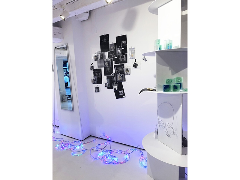
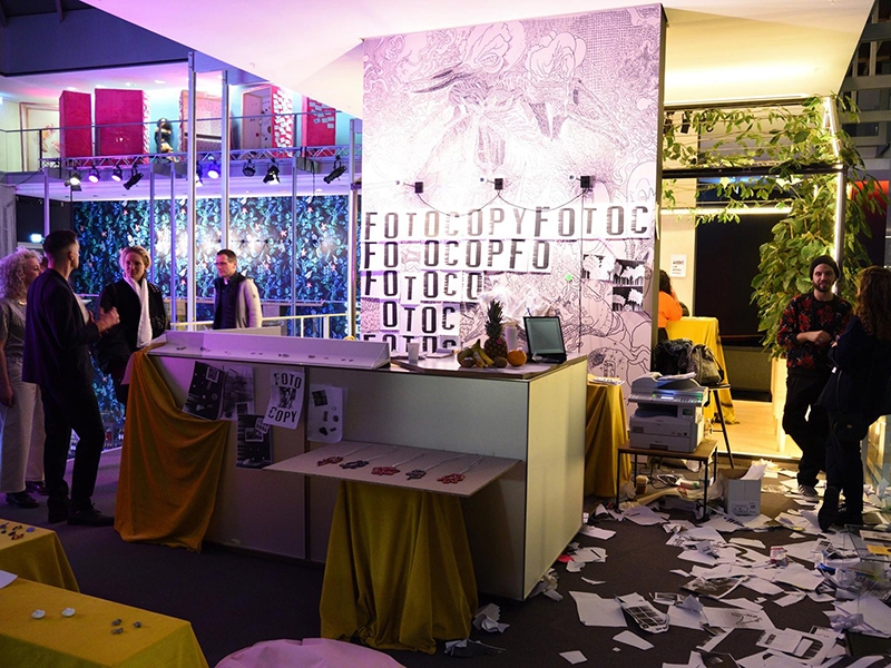
So about the concept: In Italy you find all these old independent stores that just do one thing, like a tobacco shop, or someplace that only makes frames or does photocopies, these simple places with stuff just thrown about everywhere. I’ve been in and out of Italy since I was a teenager (and lived there from 2011–2018) and have always noticed this very specific set of adhesive letters on shop windows that say just the word of the thing the shop sells or does. So for instance a copy shop would just have FOTOCOPIE on the window; it’s both the name of the store and what the store does. It’s so efficient. And the font of these sticky letters is so good. For 15 years I thought I’d open a bar one day in the States and call it Fotocopy, but the morning me, Annika, and Adam were brainstorming about what we would pitch to OHMYBLUE, it occurred to me that it wasn’t supposed to be a bar at all, but a jewelry show, and we could use the theme to riff on reference culture, how a “new idea” these days isn’t anything more than two things you’ve seen before but layered differently. We wanted to own up to the fact that everyone is stealing from each other, and somehow everyone is ok with it now, and maybe it is ok; either way, things look like other things which is why they’re relatable, and it’s really interesting because jewelry is such a perfect in-between object that speaks to personal identity or individuality but at the same time is something that groups you, that identifies you with like-minded people and makes you feel like you belong to something. It’s a wild contradiction.
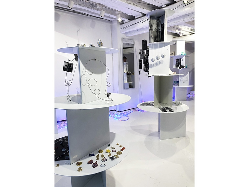
So our show is about that, jewelry hitting the sweet spot between these two contradictory things. We just want people to find pieces that make them feel more like themselves, and that they feel good when they wear it. For as much as jewelry has become overly academic and serious, we wanted to create a simpler, no-fuss space to counteract that, to say it’s ok that you just simply like it and want to wear it. Jewelry has been distanced from itself, I feel. It might still be art, but for us, it can be enough if it’s merely fun.
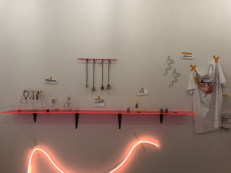
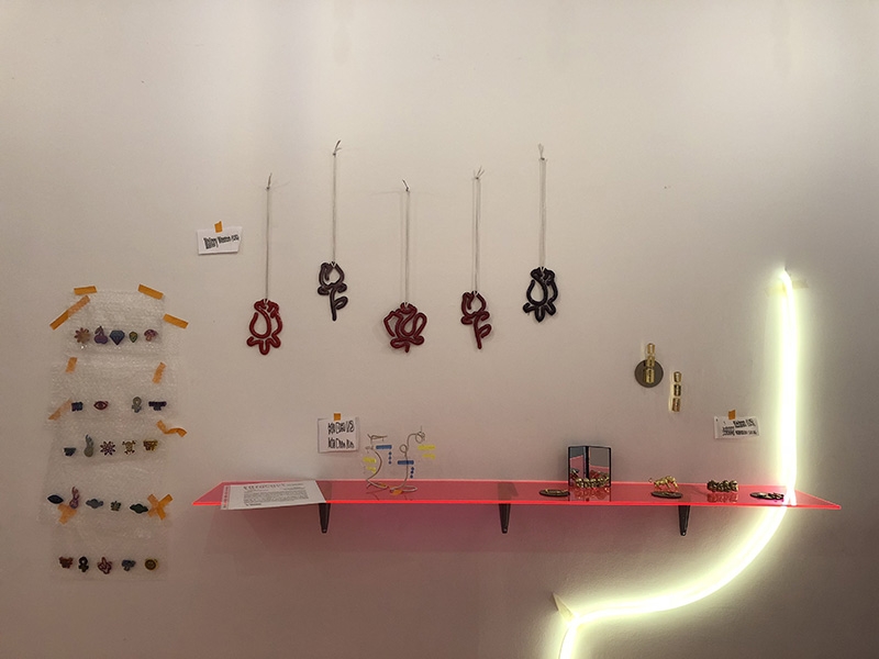
So Fotocopy, which we debuted at Munich Jewelry week in 2018, was this anti-Christ of jewelry shows, with paper scraps being thrown at everyone, we were making zines, drinking, having a great time, creating a space people wanted to hang out in and find jewelry for their every day lives. It was awesome. For the New York version, we invited some local artists living and working in NYC, alongside the original roster. For Venice, which somehow is just so chic, we added Georgina Trevińo, Stefan Gougherty, and Karl Fritsch (!) to the roster, which we are so delighted about. It just felt right; I don’t know how else to explain those choices other than by saying that. They are glitzy.
Non-Stick Nostalgia, on view at the Museum of Arts and Design (MAD), is your first curatorial collaboration with a major institution. How did this partnership as an independent curator with MAD unfold? After having produced so many shows on your own, how was working with an institution different?
Kellie Riggs: Although it’s my first solo project with an institution of the sort, it’s actually the second time I’ve worked with a museum. When I was at Current Obsession I co-curated the exhibition Cult at the Design Museum den Bosch in 2016, which I’m really proud of. I think we did a really great job decontextualizing contemporary jewelry in a profound, relatable way.
For Non-Stick, I was extremely lucky. Erin Daily, from BK Metalworks, introduced me to the very lovely and talented Barbara Paris Gifford, assistant curator at MAD. We hit it off via email, and she ultimately approached me about an opportunity that turned into Non-Stick. I was free to pitch whatever I felt reasonable, and at the time I was working with this concept of “hyper real jewelry,” thinking a lot about millennial makers’ relationship to the Internet and technology. I never would have imagined something like that would happen, especially because I wasn’t even living in New York yet, but to do the show was one of the main reasons I moved there, apart from starting grad school.
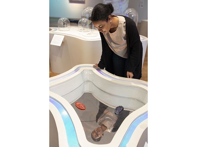
Working with an institution like MAD was a dream come true. Really and truly. I didn’t know what to expect. MAD’s curatorial and exhibition design teams where so supportive, accommodating, and talented. Same with the registrars. I kept thinking that at a certain point someone would tell me, “No, Kellie we’re not going to do that” or, “That is a ridiculous idea” … but it didn’t happen. Even when I knew I was suggesting something crazy (like a fog machine, haha!) they would entertain the idea and ask the right people the right questions. It was so professional, and the way the museum respects the pieces they have in their care is truly remarkable. Everyone really believed in my vision and trusted me, and I trusted them, too. It was a true collaboration. I could never have imagined being thrown into such a high-caliber production so early in my career. They went above and beyond to bring my weird ideas to fruition—from content to display. I had a lot of freedom.
The main difference between a show like this and something independent is obviously money. For Fotocopy there’s basically no budget, but MAD is a design museum and their job is to make amazing shows—they really go all out for them and I was honored they invested so much into Non-Stick, from building custom casework to the intricate handmade mounts all the jewelry is displayed on.
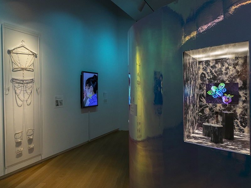
Non-Stick Nostalgia explores the tension between fear and optimism that defined the years just before the turn of the new millennium. Why do you think that 20 years later artists are exploring this brief period of time? Is it just an aesthetic trend—part of the cyclical nature of fashion—or is it a deeper global phenomenon?
Kellie Riggs: I can’t say that the artists themselves are deliberately exploring that time period. It’s me putting the Y2K lens over everything in the show. And Y2K for me is more than an aesthetic. Being a kid on the brink of the new millennium was nuts. No one knew if the world was going to end or if we would be flying around in convertible hovercraft after the year 2000.
Our identities were shaped on the Internet. We were daydreaming about the future, at the same time afraid it might not ever come, or something. We built the very first digital avatars for ourselves, through screen names and away messages. So that’s just in us. The idea of Internet technology advancing human civilization is built into our DNA.
From an aesthetic point of view, it isn’t probably much different than the 20-year recycling trend, but who cares? That whole aesthetic—blobby, iridescent, galactic, augmented—never got the play it should have. Right now people are making things that look like they belong in 20-year-old magazines. (In fashion and design it’s everywhere, look at the sneakers coming out right now, even the simple ones like Nike Airmax 720s). But overall, and perhaps more interestingly, I think people miss feeling optimistic about the future, especially right now. The globe is on fire. Trump is probably going to be re-elected. Kids are in cages. Etc. So it’s part of a bigger global phenomenon, absolutely. Today, euphoria about the future has been replaced by nihilism. People are addicted to their phones and the narcissism that comes with that, and people in jewelry are dealing with these topics too. Non-Stick attempts to insert jewelry into these broader, generation-specific conversations, and I think it worked: I’m proud to say that the New York Times reviewed the show’s content quite favorably—in their Art & Design section, not Fashion or Style!
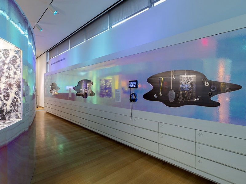
Much of the exhibition speaks to the way technology has merged with biology. We not only keep our digital devices within reach or affixed to our bodies, but we allow these devices to record us, keep track of our steps and sleep cycles, and act as vehicles to create and re-create ourselves. We use filters to manipulate our photos, put a glossy finish on our daily activities, and create avatars in real time. What’s the role of the handmade object in all of this? How does technological manipulation affect the future of jewelry?
Kellie Riggs: That’s a really good question, and perhaps the artists would have some poignant thoughts on it because they’re the ones far more caught in the mix of technological versus traditional pressures. But I think this whole idea of augmentation is really relevant. Jewelry, like everything else, is being augmented, it’s becoming cyborg with the use of crazy materials and processes. For me these developments don’t change much about the inherent role of the jewel at all. Look at Adam Grinovich’s work. He 3D prints right into steel and hand-sets huge CZs—why is this more or less interesting than something that’s “real” or “precious”? He deals with this idea of making in real time, which is how we deal with literally everything else nowadays. Why should jewelry stay behind?
Beyond the actual making, I think the physical object will forever be important. Non-Stick is explicit about this—whatever the jewel is, we’re proposing people fold these objects into their lives, whether it’s for their digital alter ego or their regular self on the streets. It’s a transformative object and so tied to feeling best in your own skin, tied to the development and expression of who you are.
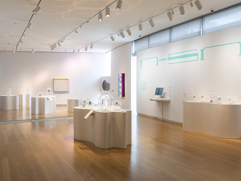
Display is always a complicated factor when exhibiting jewelry. Non-Stick Nostalgia takes display to the next level, integrating pedestal forms, surface textures, and display cases seamlessly with the overall look, feel, and mood of the show. Even the bench cushions were considered! How did these decisions get made? Did being a visual artist yourself influence how you approached the display design?
Kellie Riggs: Being an artist absolutely influenced my approach. At the end of the day, I’m a details person; every millimeter counts. I really wanted to make the show a total experience, and for it to be joyful to walk through. In the past I’ve been quite critical about big museum shows—large group shows are hard to pull together, often feel like work to get through (there’s too much), and they’re boring. We’re so used to the industry standard of the white cube that I think people believe it’s enough to just put something on a white pedestal or wall and call it a day. But as younger jewelry artists are craving more and more to relate their work to people like themselves, and to reinsert jewelry into a cultural context and create images, the standard scenario was never going to work for me.
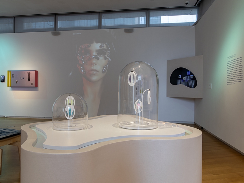
Designing the space was such a delight! We decided early and easily to use iridescent film to wrap the Tiffany Gallery oval display cases: very Y2K revival. Saturated colored lights were also an early decision and meant we didn’t have to paint any walls. (Believe it or not, I tried to be efficient!) For the background in the display cases, I wanted to create a mood of adolescent daydream. Outer space felt like the perfect reference, as did denim, so I bought a piece of denim and bleached it myself. We took a photo of it and Nathan, the exhibition designer I worked the most closely with, made wallpaper (essentially) that we lined all the vitrines with. The jewelry bases in those cases were dipped in paint and made to be reminiscent of candles, so the vitrines had a shrine-y feeling to them. I had no idea if this was going to work, and I think people had their doubts, but everything came together so nicely, I think. I asked a friend to help me sew some cushions from the actual denim (thanks, Shera!) because I couldn’t just leave the benches as they were … probably influenced by a meticulousness jewelers know all too well. It was important for me to get my hands on every detail possible.
We were also super fortunate to be able to build custom pedestals! Making them amorphous was also an easy choice, and with the help of designer Misha Kahn we came up with shapes that kind of fit together and played with light very nicely. The bell jars were really the only thing we could put on top of the jewelry (everything has to be covered, temperature-regulated, and sealed) because of the shape of the pedestals, but it was perfect for the futuristic-but-throwback aesthetic I was going for overall.
MAD was very open to putting the jewelry in the proper context, as previous shows of theirs had made efforts to do the same. Not every institution believes in this—they will throw the work in existing cases and call it a day—but MAD is an institution that believes the visual presentation is a key part of the story, and they didn’t hold back.
You’ve put forward the idea that contemporary jewelry is a cult genre, which stands in contrast to the way that the field often sees itself as playing second fiddle to the capital-A Art World. Instead, cult implies a certain cachet and prestige status among those in the know. Can you expand on this idea? Do you think contemporary jewelry can or should reach beyond this cult status and access a broader audience?
Kellie Riggs: This kind of jewelry has always been there for those who can see it. The cult analogy, for me, was a no-brainer. Hundreds of people from all over the world flock to Munich or Zimmerhof every year—we create a shrine for it, a place to gather, a place to be in discussion about it. It’s very cult-y. I think it’s very special. Think of cult cinema, The Rocky Horror Picture Show—pockets of weirdos coming together to have a good time and enjoy a piece of art others don’t care to get. Contemporary jewelry, for better or worse, has maintained a subcultural status, and I think that’s quite cool and something to be proud of. This stuff isn’t for everybody, it just isn’t. It’s about targeting and bringing in newbies. Recruitment, even. It sounds freaky, but it’s what keeps the field challenging and interesting.
But I also know I contradict myself. Of course I want more people to know about it, and for artists to be able to reach more mainstream audiences with their work. I want them to be able to sell their work and not have to compromise working with galleries that may or may not subsidize their practices enough or ask too much of them. Fotocopy is one example of dusting off these cult-y objects and putting them on offer in a more immediate way. For Non-Stick it was of course different, but including the artists’ Instagram handles on their wall labels was a very important gesture to me, so people were able reach them directly, or tag them, or whatever, when they posted photos of the exhibition. I try to build a conduit between artist and audience wherever I can.
You’re currently in a master’s program for arts administration at NYU. Talk about your decision to enter into this type of program. How has it affected your vision for the trajectory of your greater practice and work? Do you have any upcoming projects that you can talk about?
Kellie Riggs: It has to do with my passion for creating more artist equity and becoming an ally to the artists I believe in so much. Like I said before, jewelry is hard. My idea was to build a skill set that would hopefully allow me to create more ways to lift artists up and cultivate opportunities for them, without necessarily relying on institutional support (which jewelry and craft in general gets far less support for; MAD is a great exception to this, though!). So the more I can learn about nonprofits, fundraising, financial management, leadership, marketing, strategic planning, curating, etc., the better. Artists are asked to be able to do many things apart from making art: building their own websites, being their own agents and advocates, running their own businesses, etc., so I wanted to get a little more business-savvy with the goal of being able to help them eventually. How, exactly, remains to be seen. I have a year left of the program, and currently don’t have any plans for upcoming projects other than writing my thesis. We’ll see, though. There are always ideas for shows brewing in my head.
What’s currently piquing your interest within the field? Please share any compelling exhibitions you’ve seen or books you’ve read recently with AJF’s readers.
Kellie Riggs: I wish I could have seen Darja Popolitova’s iTouch Store exhibition in Tallinn. She’s a star, totally aware of the cultural zeitgeist. It’s also been fun to see what current graduates are exiting school with. I feel like we’re in a good moment in the jewelry world, on the cusp of a generational shift, actually, where fussiness is being replaced with joy, and the will to wear is ever-expanding.

