This year’s week-long jewelry gathering was slightly sadder for being so well mapped out. The Handwerkskammer provided the program, Current Obsession, a newly launched magazine, came with a large foldout map, which was a nice complement to the street finder published and given out by gallerist Kinga Zobel. To be absolutely certain of your itinerary, it was best to check those against state-sponsored street and underground maps and your own Google map. And so, people took to the street with sheaves of printed matter, occasionally fumbled with them but rarely got lost. Gone was the sight of wandering clots of Italians, French, or English jewelers looking up the sky for planetary direction. We knew where we were going.
Soon enough, more papers were added to the purely functional ones—visiting cards (hello! direct sale!), exhibition flyers, leaflets, catalogues, or books (in increasing order of permanence and budget) as well as project descriptions (Zimmerhof is coming up. Helen Britton is in Nürnberg. Yes, “Irony Forest” is at the southern exit of Universität). These were used to establish the positions—both geographical and discursive—of the nebula of projects presented in Munich. Similar to exhibition setups, printed matters were used to deploy, using graphic tools, the artistic agenda of individual projects. They ranged from the punkish to the corporate, could be self assured or tentative, descriptive or poetic, but in all cases, tried to live up to their fate as wallet-bound forget-me-nots. The AJF team harvested them on the way, and thought it would be a nice idea to decipher their relationship to the practice to which they refer. Are they evidence, manufactured fictions, or illustrations?
Collected Matters
Susan Cummins
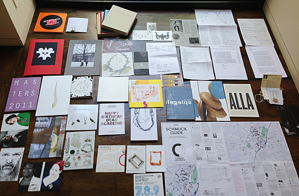
All the stuff I picked up at Schmuck created a foot-high pile and simply wouldn’t fit into my suitcase, so I sent myself a box. The contents from the box sat around on my office floor until recently when I finally laid it all out to see what was there and make some choices about what was worth keeping. As I made my way through the material, I began to detect reasons for keeping some things. I thought that I would have very intellectually based reasons for keeping everything, but as it turned out, many of the reasons were purely emotionally based and not rational at all. However, a book such as Otto Künzli: The Book is, of course, a rational choice. It is a very ambitious effort and well worth spending time reading to add to my knowledge of an artist whose work I have in my collection. Additional hardcover catalogues, for example Aftermath of Art Jewellery, with essays by respected writers are also easy picks. The other rational choices are the Schmuck 2013 and Talente 2013 catalogues. These are simply good reference materials and reminders of what was seen. As I look at them again at home, I ask myself if this or that artist is someone I will begin to see over and over again, until I finally take note of his or her name and begin actively tracking a career. This might be a first introduction.
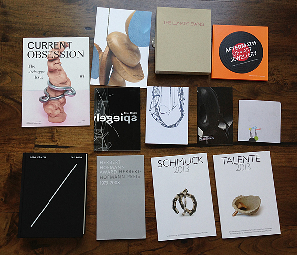
The things I won’t keep are cards, pricelists, materials about schools I have no relationship with, and information about artists whose work isn’t of interest. In the end, for me, the main reason for collecting all of the printed matter is its relationship to the artists whose jewelry is in the collection. The library I have acquired helps me to understand the ideas and stories about certain artists, but it is also a collection of stuff that will go where the jewelry goes. I am under the impression that collectors will often add libraries to their bequests. Whether or not my collection actually ends up in a museum, it is certainly both an expression of my personal taste and a partial witness of what happened in our field during the past 20 years. It seems, therefore, especially important for documentation to accompany the jewelry, especially from a field as young as this one and especially for museums without jewelry collections that would need to contextualize it. For these reasons, I think of the library and the jewelry as inseparable.
Please, Can Someone Tell Me Where I Am?
Aaron Patrick Decker
Stepping off the plane and onto the ground of a foreign city, the first things one should do are finding one’s bearing and grab a map. In Munich, there is a train directly from the airport to the city center, making the commute simple and easy. The maps available use symbols, names, and colors to create a visual vocabulary you can read even if German is not your native tongue. This is what maps are meant to do, symbolically orient us within a three-dimensional space through a two-dimensional representation. The accessibility and universality of their symbols, in fact, is key to their success. During Schmuck, however, a city map won’t tell you where all the jewelry exhibitions are or where the Internationale Handwerksmesse fair is. You must either know where you are going streetwise or have access to the Internet to search Google maps. I am unaware of any attempts prior to Schmuck 2013 to provide exhibition route planners for non-residents. This year, this problem was attacked from two sides.
Wolfgang Lösche’s team at the Handwerk fair collated a list of activities and shows as usual, addresses included. This was not a visual map, but it provided the backbone to the other two. Kinga Zobel coordinated the publication and distribution of a booklet called the “Schmuck-Finder.” It contained maps listing a number of shows with their addresses, artists involved, opening hours, and images of each artist’s work. Current Obsession magazine, with their first issue, created a large foldout map of the city of Munich marked with small dots. The numbered dots referred to a list of shows ordered by opening dates and times and featured short descriptions of each show.
The cartographical enterprise for Schmuck has seemingly bloomed in this past year. Putting the Handwerk list aside (it is self-admittedly just a list and nothing else), I wonder how useful these maps truly were. Did they fulfill the promise to easily show us how to get where we needed to go? Were these maps independent—did they operate without the need for supplemental material (i.e. U-bahn maps, city maps)? Were the maps holistic? That is, did they attempt to highlight each show, event, opening, party, etc. that took place during Schmuck?
The “Schmuck-Finder” 2013 was a good resource for finding shows. It contained several maps that were cut and pasted from actual city maps. Although not immediately clear to non-German speakers, the “Schmuck-Finder” doubled as a catalogue for the “Schmuck-Show,” also organized by Kinga Zobel. It featured a select number of exhibitions and artists who applied for inclusion. (The process required each artist or gallery owner to pay a small fee to cover production costs, but there was no selection process.) Since participation in the publication relied on voluntary applications, this booklet featured only a portion of the Schmuck program, but it did an good job of representing those who did apply. (Mrs Zobel hopes that more artists will participate next year by signing up at this website.) Unfortunately, I found the cut-and-paste method of this booklet a bit disorienting because it splintered the city into parts. I knew that once I arrived in the area the map highlighted, I could navigate it. The only problem was, how to get to this area? I had to check my city map to see where the maps matched up, and then find the right U-Bahn train to get there. Working from three printed references at once is not what I would call user friendly.
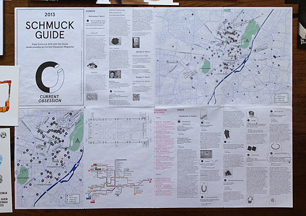
Maps and event calendars will continue to crop up to accompany the growth of our field and of the fair-related events. I was interested to understand if the presence of two navigation devices signaled increased market viability. I asked Marina Elenskaya, editor-in-chief of Current Obsession, about the profitability of the project and the likelihood of Current Obsession doing another map for the next edition of Schmuck. The magazine did turn a profit, but this was not the main reason for making the map. She explained, “Schmuck Guide was a perfect way for us to launch the magazine about jewelry most successfully and to give it maximum exposure. We also did it for fun because while being in Munich for Schmuck 2012, we had to Google a lot of people for hours and then Google the locations, too—what a nightmare!”
It is my hope that future mapmakers strongly study the accessibility, structure, and navigational power of their maps. They should create a map that doesn’t need pre-existing ones to function, but operates on its own and is informative both visually and through its coverage of each event. When asked about the functionality of their map and whether they will do one for Schmuck 2014, Elenskaya replied, “Yes. We would like to a make Schmuck guide for next year. The process of making such a guide is super painstaking. It requires a lot of precision and a lot of emailing. Nevertheless, we really enjoyed it. For the next year, we are planning to collaborate with Müncheners to get some help with the mapping. We would like to make the map better and more detailed, including the U-Bahn and S-Bahn stops and things like that. We like the idea of including places to eat, have coffee, etc. and are planning to do it again.”
What do these maps make visible other than the geographical locations of the Schmuck events? Looking at them gave me a sense of the scope and remarkable growth of the program in the past 10 years. (In 2004, the year the first program was printed, it listed 12 events; in 2013, it had 67.) If, as I hypothesize, these maps and the multiplication of events bear witness to the success of our field, then by that measure it is doing very well. Being of a cautious nature, I will wait and see if the field believes in accessibility and exposure and is prepared to pay for ads in forthcoming editions of the maps.
When it was first published, this article did not accurately describe the selection process for the Schmuck-finder: those inaccuracies were pointed out to us by project-leader Kinga Zobel, and the article you are now reading has been amended accordingly.
Words Worth
Marthe Le Van
My interest in selecting and arranging words into cogent thoughts borders on obsession. At the same time, I harbor a rather hostile attitude toward reading most curatorial text. This antagonistic relationship causes a fierce and persistent internal conflict. I am glad to have the opportunity to question its existence using Schmuck as a backdrop. Come with me to confession.
In choosing to wrestle with this topic, I am afraid of being judged frivolous. Am I an apathetic viewer if I do not read the writing on the wall or in print? Am I foolish to want to grasp a concept or theme without clarification? Am I arrogant to value my experience more than well-researched curatorial explanations and different points of view? Am I simply not smart enough (or not schooled enough) to understand how these texts are essential to my comprehension? Do I fancy myself too gifted or am I too pompous to need them? Is writing a required wall in the whole house of cards? Is it merely a case of a busman’s holiday?
Fast forward to Schmuck 2013, and I am standing outside the Otto Künzli retrospective, itching to discuss the artist, the artwork, and the exhibit. There is much murmuring about a lack of text both on the wall and on the showcases. As a matter of fact, this was the most urgent topic on the minds of my colleagues as we shared our initial thoughts on the exhibit. With little writing offered, how could the masses accurately understand the work or appreciate the artist? (Damian Skinner fully articulates this in his superb review “A Künzli for Our Time?”)
In all honesty, the lack of text never even entered my mind. Was I missing some sort of internal curatorial checklist? I was initially puzzled, but now know that this jolt was pivotal to my growth. At Schmuck 2013, I became aware that the emotional experience of art fits me and feels better than its intellectual counterpart. I strongly believe in art’s ability to be profound and transformative. Onsite exhibition text is useful for providing the “who, what, when, where, and why.” When it strays into commentary or assertion, however, it does not work for self-directed viewers like me. I feel it degrades, even intimidates, the legitimacy of individual interpretation and infringes on a sacred space.
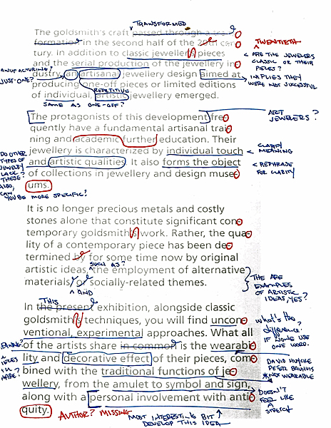
Words were used to steer and shape my Schmuck experience at every turn. Some were effective. One of the text panels introducing Neuer Schmuck für Götter offered a solid explanation of art jewelry. I was so impressed that I took a photo of this notably concise (but badly hyphenated) gem. In retrospect, it reads like a free Internet translation (see photo).
The professor-docents of ConSpiración: EASD València y Escola Massana supported their students’ work well. One teacher accompanied me the length of her display tables, tailoring her explanations to correspond to my perceived interest. She positioned and pitched the work with enviable skill.
At Fallmamal-Umsturz erwünscht, I fell deeply in love with Anja Eichler’s jewelry, read her entire catalogue on the spot, and bought a copy. I related to Eichler’s writing as well as her jewelry—both are capable of expressing vulnerability because both are built on a secure foundation.
At Bucks & Barter, the need to express the show’s concept seemed stronger than the concept itself. Before Schmuck, I received a detailed press release on the show. After viewing the exhibit, its brief was retold to me. A lot of words came with this small show. They accompanied me to the space, chased me through it, hindered my exit, and didn’t feed me anything new.
Like most Schmuck attendees, I amassed a big bag of printed materials and schlepped them home—a satisfying (and affordable) means of collecting, but perhaps more significantly, a vestige of pre-Internet life. Perhaps one day I will want to revisit the exhibits with something I can hold in my hand, but for now the stash remains tucked under my desk—even while writing this essay.
When I need to fact check details or read an artist’s statement, the web delivers faster than I can thumb through a pile of postcards and flyers. If all exhibit materials were digital, they would be easier to organize and access, they would create less waste paper, and one could chose to investigate them at will.
In contrast to Damian Skinner’s position in A Künzli for Our Time? 1, I believe objects can speak for themselves. I feel they often do so more eloquently and persuasively than their translators, and the best environment is one where viewers can listen, connect, and know them. This ability is what sets the good objects apart. To assert this approach as anti-intellectual is to restrict the definition of intelligence. I like to think that the body of truth that exists in all artwork is summoned from many types of intelligence. Thereby, the effort toward understanding it should be a holistic and ongoing study that embraces the intellect but does not acquiesce to it.
Das Buch
Benjamin Lignel
Hufnagl, Florian, ed. Otto Künzli. Das Buch, Jacqueline Burckhardt, Walter Grasskamp, Carole Guinard, Florian Hufnagl, Otto Künzli, Ellen Maurer-Zilioli, Pravu Mazumdar, Chantal Prod’Hom, Akio Seki (authors), Munich/Stuttgart: Die Neue Sammlung, Arnoldsche Art Publishers, 2013
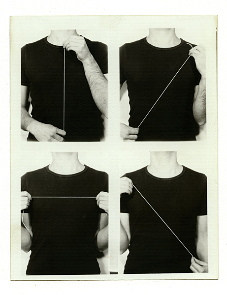
If my assumption is right and Professor Künzli had a pervasive influence on the conception and design of the book, it would explain a certain enjoyable quirkiness in this awaited monograph. Firstly, the organizational system is chronological but presented as if it were thematic. Künzli follows the artistic convention of presenting work as distinct “bodies.” Recurring themes or forms from the same period are allowed to pool together, but the book appears to hopscotch between different categorizing systems. Works are sometimes grouped according to formal archetype (Hearts, House), place (Japan), project (Miki Motto), or theme (USA # ONE), and the actual sequence of things is very slightly rearranged to adapt to Künzli’s neater version of the story under chapter headings that make no reference to time or progress. The result lets the reader enjoy the work less as a history than as a catalogue of creative stories that dialogue with one another from the safety of their individual chapter.
Secondly, the book provides evidence of Künzli’s creative output through a wide range of material—photos of work; photos of photos of work; poster, magazine, and newspaper reproductions; installation shots; and performance shots. This is by no means uncommon in an art book. But while art historians like to bookend their presentation of artworks with source material and examples of cultural dissemination, they tend to do it in black and white, to ensure the primacy of the work over its documentation. Not so here. Künzli seems to delight (as does the contemporary jewelry field at large) in seeing his work reduplicated in images. There are 43 facsimile reproductions in the book, and a conscious effort has gone into presenting these documents and the things they document on an equal footing, as if to erase the ontological distinction that might exist between, say, this photo of the Black house brooch and its reproduction to scale on a exhibition announcement on the opposite page.
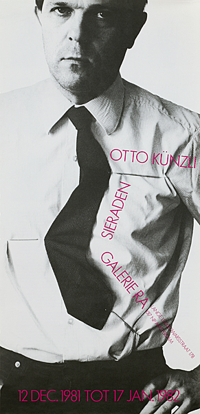
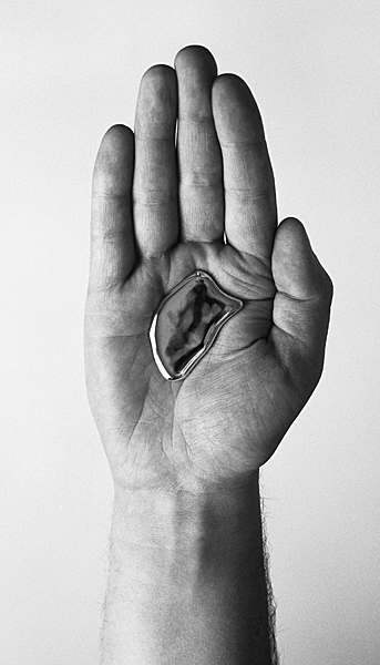
My second regret is that I would also have very much liked to have seen more examples of Künzli’s work as a curator. Arguably, documenting his lifelong interest and experiments in showing jewelry would have made this fat book even fatter, but it also would have given future generations an insight into how he has let his work and the work of his students negotiate the third dimension. (I have heard from Künzli that he is interested in producing a book dedicated solely to this aspect of his work at the Akademie, so let us not complain.)
The book was presented to us as a complement to Künzli’s retrospective exhibition at the Pinakotheke. It was referred to as an “accompanying text to the show” by co-curator Dr. Petra Hölscher. I am not convinced that it served that purpose well. While the exhibition certainly would have benefited from more curatorial texts, no one on opening night had a book with them. That definition of the book, I think, only reflects on the exhibition’s particular weakness. The more relevant question, arguably, is whether it does justice to Künzli’s life’s work. The answer to that question very much depends on what you expect from artist monographs, and whether you want them to succumb to the temptation to immortalize their oeuvre or take the risk of letting some of life’s unruly chaos into their printed legacy.
Das Buch does a lot of the former and a bit of the latter. The images, as discussed, are staged to perfection and give little clue of how this challenging work was appropriated by users. (There are very few images documenting how Künzli’s work lives on “real” people outside the (visual) lab. The one notable exception is a mosaic of pictures showing this friend, that collector, or this minister wearing the Gold macht blind bracelet in situations that suddenly feel very real.) The essays also try too hard, in my taste, to establish what I already know—that the “Swiss master” has produced spectacularly good work in the course of his long (and open-ended) career—and this sometimes sugarcoats the real insights that are provided in the essays. (Pravu Mazumdar’s text, in particular, delivers some of the most cogent, and in my eye, pertinent analysis of Künzli’s piece. Look out for his study on the Wolpertinger.) The more succulent nuggets are to be found on the margin of das Buch’s conventional monographic structure. In the detailed index of works (pages 606 to 639) titled “Paralipomenon[1].” These digressive endnotes run like an intimate voiceover to the catalogue, delivered (as always) by the man himself, in which he details some techniques he uses, recounts the encounters that led him to them, and generally puts the passage of time back into the monograph.
This was not meant to be a book review. I was interested in looking at the creative and strategic decision that governed the making of das Buch—how photography was used to translate three-dimensional objects into visual statements and how objects were catalogued and texts built into this definitive OK bible.
Within these parameters, das Buch is traditional to a fault. Valedictory essays written by a select posse of respected craft and art authors provide a solid (or at least varied) bed of words from which volleys of images are launched to plot the chronological evolution of an important artist. This long gallery is capped by a wealth of technical and historical indexes, lists, etc., as one would expect from a retrospective monograph. This is what reference art history books have been looking like for a few decades, and the genre’s simplicity continues to please historians and researchers who prefer it to more hybrid formats[2].
The result is not as engaging as it is thorough. It also shows that Otto Künzli, a keen student of the way value is created, is not immune to the persuasive charm of coffee-table inventories. Like red dots, they are a neat way of saying “this is all mine.”
[1] The short explanation of this word is ‘Supplement to one’s literary oeuvre, possibly including textual variants’. A clever way of saying that it consists of the author’s pre-posthumous re-interpretation, re-writes, and anecdotal add-ons.
[2] A good example of the latter is Peter Bauhuis’s ABECEDARIUM, also published by Arnoldsche, that force feeds a wealth of factual and fictional tidbits in an alphabetical grid: the hyperlinked conversation that it creates is fascinating, but much more demanding than das Buch’s three-part structure.
