Choosing Ted Noten as the first Framed curator establishes the museum’s position as a museum of the twenty-first century with a self-appointed mandate to merge fine art, design, and crafts. Ted Noten’s work is very eye catching, and he himself has become a cultural icon, albeit a disputed one, in the jewelry scene (known for being self-imbued and shameless, Noten is not everyone’s darling.) His election as artist of the year (2011) was met in the Netherlands with applause and appreciation as much as criticism and disdain—a very Dutch way of dealing with the success of others.
A concept such as “the exhibition as a self-portrait” panders to Noten’s reputation, and depending on where one stands, choosing him can either seem very risky or very nimble. After all, at least in modern times, a self-portrait is often about artistic status and prestige. It was only during the period of the Renaissance that artists started depicting themselves in their art. A craftsman would have never done this. These early self-portraits talked about their position as an artist, about their profession, and about artistic importance. The early Renaissance artists cautiously came to the fore: the first self-portraits of painters remained mostly “hidden,” for instance depicted in a mirror or a shining surface. Jan van Eyck’s portrait of the Arnolfini Wedding (1434), with the mirror on the back wall showing him in the act of painting the scene, is probably the most famous example of late medieval “hidden” self-portraits. In this case, the inclusion of the painter in the painting seems to point at a new sense of realism and truth. A very tiny depiction of young Caravaggio with a paintbrush, reflected in the carafe on his Bacchus painting (c. 1595), was in the news in 2009. Hardly visible with the eyes and detected thanks to new technology, this self-portrait may indicate that the artist painted his Bacchus after a living model—a message that seems to have had special meaning for insiders. Other Renaissance examples, such as Albrecht Dürer’s self-confident self-portraits and Tiziano’s depiction of himself as a well-dressed burgher, indicate great self-esteem.
It is typical for the spirit of the time that Benvenuto Cellini—the famous Renaissance goldsmith and sculptor who managed to fill the gap between crafts, design, and art—wrote Vita 1558–1563, an autobiography that sketched a colorful picture of his personality, showing a great self-regard and bias. Cellini wrote his “self-portrait” as a way to prove his excellence over goldsmiths, sculptors, and his noble and papal patrons. (The narrative also describes a good dose of misfortune.) In this written portrait, prestige is at work as well. The Vita retraces the life of a goldsmith who breaks out of his circle and starts competing with artists of higher hierarchy.
Maybe it is a sign of the spirit of our time that an unruly jewelry artist, one who has been busy breaking out of the boundaries of his trade for many years, is asked to make a self-portrait by means of an exhibition showing the sources of inspiration that shaped his identity as an artist and also his frustrations. For instance, including Damien Hirst in the show allowed Noten to talk (through one of the small videos in the exhibition) about the fact that he and Hirst started enclosing dead animals in their work almost at the same time. Noten “curses him” because the fine artist found superlative economic success based on his artistic prestige, while the jeweler is still plodding along.
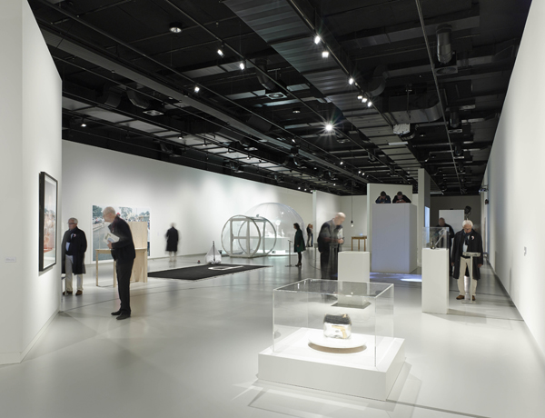
Ted Noten has structured the exhibition along 10 different themes that, in his view, are essential in the arts—“The Comprehensive,” “Greed,” “The Unattainable,” “Beauty,” “Desire,” “Pleasure,” “Obstinacy” (Weerbarstigheid), “Intimacy,” “Mortality,” and “Shamelessness.” One may wonder if these are all essential themes to the arts in general. They seem more related to the work of Ted Noten, and this is where the aspect of the exhibition as a self-portrait starts working. The themes are visualized as circles (a pearl necklace) on the floor of the 700-square-meter exhibition space, and each theme is positioned within a wall-less space.
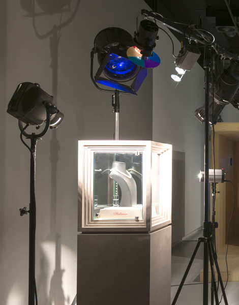
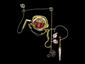
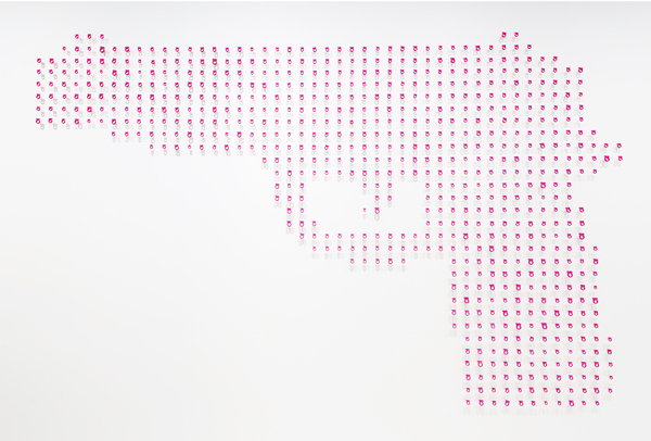
There is not much Ted Noten work in the exhibition, but his most recent body of work 7 Necessities is part of it. This body of work is a puzzling pastiche on the woman as a stereotype, consisting of a group of accessories. A mask, gun, chatelaine, helmet, chastity belt, purse, and glasses are 3D printed in white nylon and elaborated with gold, diamonds, and gems. The Beauty Mask is shaped as a replica of the face of Nefertiti, the legendary Egyptian queen and beauty, with little holes to inject Botox in the face of the woman longing for beauty. The potency of this self-help object, with compartments for a syringe, bottle of Botox, towel, gloves, and a golden suicide pill in case the treatment does not succeed, is suffocated in literality. It does not reveal the absurdness of beauty ideals, nor does it succeed in touching upon issues of power and autonomy in aesthetical surgery.
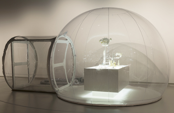
These showpieces of computer-aided virtuosity are arresting from a formal point of view. One can admire the elaborate designs, the inventive compartments in each of the 7 Necessities, down to the perfectly functioning hinges and screw threads, which are all 3D printed. But as a whole, this new body of work is not very sharp or very evocative conceptually. If there is irony in the work, it does not coalesce into a position, and those stunning objects seem to be rather meaningless. As a result, it is unclear if the work is an old-fashioned homage to “the woman” (unmasking Ted Noten as a typical goldsmith) or if the theme is just a vehicle for making new work that includes some of his favorite themes: weapons, pills, and accessories. Maybe, if they were displayed under different conditions, they would have communicated better. Now, exhibited in a hermetically closed transparent tent, the 7 Necessities become rather clinical, in contrast with the “Desire” theme of which they are a part. A short movie on a tablet with the artist talking affectionately about the 7 Necessities is their sole rescue.
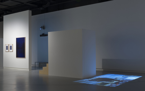
The exhibition in general is an example of thoughtful curatorship, a mixture of various art forms in an inspired story about big themes. There is a poem titled “Style” in the show. It is not exhibited in a book, but a recording of Charles Bukowski reading the poem is played from a specially designed pillar with a horn. This is an example of the care with which even the display of something ungraspable, such as a poem, is done. A fragment from Wim Wenders film Der Himmel über Berlin (Wings of Desire) is projected on the floor. You can watch it from a small tribune that was especially designed for this aim. Mounting the stairs, watching the film (and the rest of the room) from high up, and descending again, provides the visitor with the unexpected pleasure of isolated viewing.
The “Comprehensive” includes a breathtaking gelatin silver print of Lake Superior, Cascade River by Hiroshi Sugimoto (1995) and Otto Künzli’s Kette (Chain), made from 48 used wedding rings, together with the accompanying book that collects all the stories of the former owners of the rings. Wim Delvoye’s Anal Kisses, made with lipstick on letter paper of international hotels, and Jan Fabre’s Bic drawings on paper and cibachrome hit the mark of the “Beauty” theme.
Within the theme of “Shamelessness,” a decorated Dayak skull is exhibited. It’s not shameless, Noten argues in the accompanying video, that the Dayak people took the skulls of their diseased ancestors to carve decorations into (although Western people do feel like that), but it is shameless that we, the colonizers, took the skulls from them. The same theme shows Manfred Nisslmüller’s Hängenadel, gold pendants meant for suspending two pieces of raw meat. To visualize this idea, a video was made.
The “Pleasure,” “Intimacy,” and “Mortality” themes somehow disappoint. The combination of themes and artworks seems less strong. Waste by Damien Hirst, in the “Mortality” theme, looks like an excuse to have the artist in the show, while Charles Averey’s drawing Untitled (Hunter’s Cabin) seems lost within the “Intimacy” theme.
The “Obstinacy” theme, on the other hand, holds a choice of wonderful, disordering, and affecting works of art, all of them the result of an unconditional obstinacy. Bas Jan Ader’s short movie Fall (1970) shows the artist riding his bicycle at high speed into the water of the Prinsengracht in Amsterdam. Jeroen Offermans’s video The Stairway at St. Paul’s (2002) is an absurd and passionate attempt at backwards singing and playing. These works by Dutch artists are like the objectification of the beautiful Dutch word weerbarstigheid, a combination of stubbornness, obstinacy, and unruliness that has no English equivalent.
The Framed exhibition is a sparkling exhibition that unites works from different backgrounds and different periods. Noten followed his own fascinations and made an exhibition that exceeds categories, bringing together “high” and “low” art, science and home industry, fine art and crafts in a non-hierarchical way—a pearl necklace close to a Francis Bacon crucifixion; a pleasing, scientifically designed train signal close to an Abramovic video. This is the power of the craft artist whose frame of reference is broad and diverse. There are no texts in the exhibition. The only explanations by Noten are provided by videos on tablets. These videos, however minimal they might be, give some understanding of Noten’s considerations, motivations, and passions.
And yes, the exhibition is also a self-portrait of Ted Noten, reflecting his sense of humor and his own unruliness. As a curator, Noten moves swiftly between photography, ethnology, film, literature, video art, sculpture, and design, and the result is a multifaceted and entertaining exhibition featuring combinations of works that look surprisingly natural. Noten’s sixteenth-century predecessor, goldsmith Benvenuto Cellini, sketched a heroic image of himself in his Vita. In Framed, Noten puts himself in the company of artists of world reputation. Is this his way of sketching a heroic image of himself? Some people do think so and criticize the exhibition as another proof of his great self-esteem. On the other hand, this must have been one of the reasons why the museum chose him. Modesty doesn’t make a good exhibition. (By the way, it is not only big names that run the show; there are also anonymous pieces and work of lesser known artists included.) But in the end, I think this criticism misses the point. My appreciation goes to Noten-the-curator for the sincerity of his choices and the way he managed to crisscross the arts in a wide sense. Of course, you can criticize some choices and lament the rather poor selection of design objects, but Noten-the-curator brought things together in his own unique way. As a self-portrait, Framed gives an insight in his nimble mind and the wide scope of his interests. Anyone who has followed Noten’s work over the years will see that the choices he made come right from within and are not prompted by a will to excel.
[1] The scenography was designed by Berry van Gerwen. The exhibition concept is credited to Elly Stegeman, Gert Staal, René Pingen and Ted Noten.
