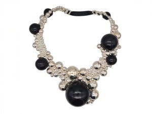
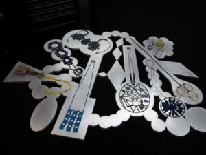
Flipping through the pages of Sondra Sherman’s catalog for her most recent body of work, Found Subjects, readers are greeted by a wide variety of jewelry, nestled into the pages of books taken from Sherman’s personal library. Each piece was made in response to the book in which it lives. The formal language of the work varies widely, as the inspiration for each work was a response to the corresponding book’s title and visual cues. Like finding scribbled notes in the margins of a book, these pieces of jewelry feel unexpected and deeply personal. The jewelry is often disarmingly simple, with beautiful overlapping details that unite each piece with the book in which it lies. In order to accommodate the jewelry, pages of the books have been altered; written content has been cored from the original object and replaced with a physical, visual content that is subtle, pliable, and enticing. When leafing through the catalog for the 2011 show Found Subjects at Sienna Gallery, one has the feeling of unwrapping a gift. The catalog turns the work into a Russian nesting doll: each piece of jewelry lives within a book, which is in turn presented inside the catalog, another book.
Found Subjects is an ongoing series of work shown most recently at the Hunterdon Art Museum in the spring of 2014. I had the chance to discuss the catalog and the body of work it represents with Sondra by email.
Sections of Sondra’s reflective catalog essay [1] have been inserted in the interview. These sections have been indicated with italics.

Sondra Sherman: In exhibition, the books are presented on whitewashed plywood quasi library lecterns tailored to their individual size and haphazardly arranged in the space. The presentation allows the pieces to borrow authority from each other and from both the status and misunderstanding of installation as a format.
The table is an integral part of each piece and the concept of the series as an exhibition. The tables and books complete each piece as a contemplative object when not being worn and propose an expanded context for interpretation: one that is distinctive from conventional jewelry contexts, but does not completely disown the personal/domestic framework by relying solely on the white pedestal of the art gallery. The combination brings in multiple contexts—as jewelry, books, quasi furniture, quasi library lecterns, and quasi pedestals, they refer to personal and domestic spaces, and the imaginary worlds of authors, readers, and artworks.
But it is endearing. It resembles a room full of people milling about. They are all wearing the same uniform on a variety of body types. Some are more matronly, some a bit frail, and others sturdily scientific. A sense of sociability develops, first suggested by the tables as figures themselves, the imagination of a figure standing at the table, and ultimately, that figure is you—surrounded by some quiet characters with whom you might have a conversation.

Sondra Sherman: I have not read the books. My library has been organized by color and size for over fifteen years, except for the year it spent as a wall of liquor-store boxes in the dining room of my ‘charming’ (you know what that means…) 19th-century apartment in Kingston, NY. Its ‘Pantone-ian’ organization was a late-night inspiration as I observed the visual noise of the bookshelves might be quieted down if color order ruled over subject or title.
I collected old books with the intent to read them prior to the library reorganization. Afterwards, binding color, typeface, and imprints entered my awareness, creating a sort of poetry in combination with odd phrases of titles. I began to collect books with no intent to read them, only for how a cover or title resonated with me, and maybe … on occasion, to enhance a color field in my bookshelf composition.
I usually prefer the book to the film of any story, because it is richer and boundless in imagination. I think creating the jewelry in response to, but without reading the book is a little act of rebellion. The jewelry reflects the metaphors sparked in the imagination by the title and visual elements of the book within the contexts of jewelry and books. I didn’t need to read the book to have an impression which is expressed in the language of jewelry, and which invites the viewer to make up their own version of the book’s content or the jewelry’s meaning. In earlier work I have often used literary references and wordplay as titles to create an interpretive viewing perspective for the jewelry. I have also often created presentation boxes for jewelry pieces to extend the surface of the piece in a composition for contemplation off the body. That was also an impetus for creating and presenting the pieces in response to vintage books.

Can you expand a bit on this idea of rebellion? What did you find rebellious in the idea of responding to the book as an object?
Sondra Sherman: “… a little act of rebellion” against the expectation that the object created in response to a book would assume the book’s content as inspiration as opposed to the imagination of its contents, or the poetry and metaphorical power of its title, or the book itself as an artifact. Why do I keep so many books I read long ago and will never read again, as well as many books I have never read and will likely never read?
What does the jewelry gain from its proximity to the books? Is it your hope that the jewelry will absorb the object’s lived history?
Sondra Sherman: I think the books offer another doorway to personal interpretation and shared experience that is often part of jewelry. I don’t think of the jewelry absorbing the books’ lived history, but in choosing old books as inspiration for contemporary jewelry—it does frame a conversation between the present and something from the past, as well as between jewelry and literature.

I love words and literature. They have contributed to my work as inspiration or reference, present as the title of a series or individual piece: Anthophobia 2007 (fear of flowers), Hidden Agender 1999, Armor and Amour 1997, and onomatopoetically in Drip, Drop, Plop or Drop, Drop, Drop, Drip from ‘Cascades’ 1995. Somewhere along the line—perhaps it was the last move, coast to coast—packing all those books again, something prompted the idea to allow the unread books to directly inspire a piece of jewelry and boast another life off the shelf.
Do you see the books as jewelry boxes, or more as active interlocutors with the pieces of jewelry they contain?
Sondra Sherman: I see the book in dialogue with the jewelry piece. The jewelry responds to the title and visual elements of the book, and the book—which provides a context and title for interpreting the jewelry piece when not worn—suggests other participants, like the author or a reader. It was disturbing to consider disassembling the book and that ambivalence was only assuaged when I decided to leave the pages loose—so that in flipping through the book an extended conversation between the book and the piece is revealed.

Sondra Sherman: I don’t think of the wearer’s outfit as providing a different “visual background” as much as a different aspect of the wearer’s public identity, which we consider in relation to what the jewelry expresses.
I see the loose pages of the book differently: some of the books don’t have any illustrated pages so there is no significant difference in background. The books with illustrations create an expectation that causes the viewer paging through any of the books to anticipate/imagine a sequence of information. Whether illustrations are present or not, being able to page through the book brings a sense of looking as “reading/imagining.” The physical act of paging through still sparks that anticipation and probably a bit of hope to find something to relate to “the story in their head.”

Sondra Sherman: I think I was imagining one or the other at any given decision in making the pieces.
Listen! the Wind—that’s such a dramatic title, with its exclamation point and appeal to the reader to imagine the circumstances that would elicit such an expression. I loved the precise embossing of the airplane—it seemed so technical in comparison to the title. For me the pendant has a similar sense of paradoxical character. Its scale, haptic experience (it is hollow and lighter than one would expect looking at it), and precise but light-handed/reductive form send mixed messages; its presence fluctuates between toy, charm, and crucifix. Everyone who handles it turns into an 8 year old—“vroom, vroom, vroom”—but when worn, its material, scale, and quiet form make it a more poignant symbol.
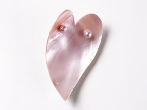
For Julia Newberry’s Diary, the hot pink color of the cover seems outrageous, yet the name, typeface, and gold floral border suggest a lady of a certain social stature and seriousness. I used the oval form of the title border in a vertical orientation associated with portraiture and cameos, but I made the border askew to the oval—actually, I decided she was a bit tipsy. I think of the brooch creating a similar ambiguity—initial viewing would be based on assumptions, presuming a classic oval with ornamental frame, but something is off, is it intentional? Upon closer viewing the hot pink nail polish interior is visible, and it becomes apparent there is no aesthetically determined order to the gold dots on the surface—they land where they are needed as support structure … it’s sort of a promise of order revealing a disorder that becomes more interesting to discover. I am more interested in what did not make it into Julia’s diary.

Sondra Sherman: I think the demeanor of the jewelry that fits into these books is pretty modest, but yes, jewelry does step out in public—maybe saving the trouble of joining a book club to instigate an interesting conversation. I have this floating theory (here comes a gross generalization) that artist jewelers (including myself) are relative introverts in the larger realm of art or design—asking the wearer to be their surrogate extrovert—so conflating the two types of interaction creates a familiar uneasiness which I accept and find worthwhile.
Through the inclusion of the presentation tables and modified books, you have built an extended habitat for your jewelry, giving it a place to exist off the body. In some ways, this means that each work will always be missing something—either the context of the book it was created to respond to, or the presence of a body on which it is meant to be worn. How does the meaning of your work shift between these two contexts?
Sondra Sherman: In recent work, I am less interested in the generic “body” than in the psychological and social identity of the “wearer.” Books are also associated with an identity: that of the author or intended reader (if not a character in the book). Elements of the jewelry are recognizable as jewelry, so to some degree even when a piece is viewed in the book, a wearer is still implied. What the book brings to those associations is the interpretive mindset that is not always brought to jewelry. The way the jewelry pieces breach traditional conventions also invites interpretation, but the meaning shifts more dramatically when worn—with the identity of a specific wearer and the occasion in which it is encountered. To my mind, that is part of the richness of the format.
Your previous bodies of work, while varying widely between one another, had an internal unifying formal language. Found Subjects, on the other hand, employs a very wide visual vocabulary. Several works, such as Red Fruit and Art in Everyday Life are similar to your ongoing series Anthrophobia, using hollow-form construction and vibrant accents of color. Other works in Found Subjects are more open, with the quality of a free-form line drawing; I’m thinking in particular of Sumpf und Wasserpflanzen and Singvogel. Why did you decide to use a broader approach in the creation of this body of work?
Sondra Sherman: It was an oversight in my concept for the series to not recognize that the challenge in this project—to consider a new subject with each piece—would be so formidable.
What ‘seemed like a good idea at the time’ turned into … ‘What was I thinking?’ I have continually followed curiosity, and sought new challenges over multiple series of work, but responding to individual books of varied character in a form particular to each came to feel like slightly schizophrenic creative acrobatics. I could have made a series of works for each book.

It is my nature to ponder in making. I prefer to explore something I am engaged by on multiple levels over a series of pieces. Intuition, interests, and experience inspire research which folds back into new intuitions taking material form. Perhaps starting as a painter left a mode of adding and subtracting which is impractical to metalwork, or maybe because I’m a Libra, or commitment phobic … I can’t decide.
In the various series of my work, the form language changes with any more significant changes of subject. In Found Subjects, I drew on the range of vocabulary I had developed over time and also at times felt the book needed a more distinct form. The other contributing factors were time and seeking new challenges. The series is ongoing since 2010, and as time passes, curiosity drives changes in my personal interests and approach.
The catalog seems to have a special significance in this show, as each piece was designed to exist in conversation with a book. The catalog fosters the same kind of interaction as the work.
Sondra Sherman: In previous iterations of this exhibition, we allowed everyone to page through the books—this was not practical in less controlled spaces, so the catalog is more important in creating some sense of that interaction of viewing the book cover, discovering the object inside, or paging through the book to view different interior relationships between the object and images. We tried to reinforce that effect by having the interior images of the larger books divided across the two pages as if you were looking into the book.
What have you learned from this work? Will you be continuing the series?
Sondra Sherman: What I learn from any series of work changes as I gain more distance from it. Initially what stands out in Found Subjects is what bothers me, or what is unsatisfied by the parameters of the project. I was initially intrigued by responding to a “found subject,” but ultimately it feels too broad. My rebellion failed. I learned that it is fairly difficult for the general viewer to approach something literary in a way that’s not literal. I think I should know that by now.
Part of what interests me in the format of jewelry is the psychological access it affords, but I appreciate those lessons which indicate that in some aspect the work is ambiguous. It confirms that the viewer is engaged and a conversation occurs. I would be uneasy if there were no questions in that conversation.
I never feel I am finished with a series, so I reserve the right to revisit all of them!
In answer … sort of, yes and no; I still have some books which I’m interested in responding to with jewelry, but the way I respond to them may change more significantly. Books whose title and/or subject matter have more personal meaning for me may inspire a whole series of jewelry which considers one subject more deeply and is presented independently of the book.
INDEX IMAGE: Julia Rosa Newberry, Julia Newberry’s Diary, New York, W.W. Norton & Co. Inc., 1933
[1] Found Subjects (Lenox, MA: Sienna Gallery Press, 2013). A catalog statement.