As each edition of Schmuck grows in size, so does the frustration of its constituents. Chagrin about the insularity of the field accompanied the AJF team like background music during its four-day reporting extravaganza. Be that as it may, Schmuck 13 (the event) was anything but bearish: 67 exhibitions, 2 book launches, 5 lectures, and 1 party took over the city’s museums (6), galleries (18), studios (13), as well as a creative assortment of shops, offices, restaurants, cafés, and metro stations, with 1 bus, 1 castle, 1 bowling alley, 1 church, and several trees thrown in for good measure. This attests to the unflagging enthusiasm with which gallery owners, museum curators, and editors want to showcase the latest, the newest, and the best to the large crowd of visitors that came to Munich from all over the world.
If jewelry (contemporary or not) is best appreciated during quiet one-to-ones in the dressing room, Munich is not it. The turnout was strong, the exhibitions dense and varied, and this immersion distorted one’s impressions as they were subjected to both information and feedback overload. This was an exercise in seeking elusive tactile and emotional encounters with jewelry objects while caught in between jewelry’s endless reflections in books, flyers, photos, and maps and the rhetorical figures that give them a subtext—the oration, the whispered confidence, the heartfelt description, the sidewalk chat.
We felt that the mass of information and experience gleaned over four days was actually counterproductive to seeing work precisely and understanding the difference between this and that practice, this solo exhibition and that group project. And so, rather than report on specific works or exhibitions, the AJF team decided to focus its attention on the way the field interfaces with its public (incestuous as it may be). Specifically, we looked at how jewelry was showed, sold (or not sold), and promoted; how exhibition setups, pricelists, and printed matters were used by different participants; and what these interfaces can tell us about their practice. These themes are the subject of three articles—including this one—from our new InSight series. In addition, AJF is publishing three more pieces that spotlight Munich: a members’ interview of Schmuckszene mastermind Wolfgang Lösche; a review of Otto Künzli, die Ausstellung by Damian Skinner; and a review of Neuer Schmuck für Götter (New Jewelry for the Gods) by Aaron Patrick Decker.
We found that Munich provides an exaggerated version of the issues prevalent in the field at large. This series in not so much about Munich as it is about the field of contemporary jewelry as it summersaults for attention in the Bavarian capital.
The Setup
Any jewelry exhibition must contend with the constraints of the medium—pieces tend to be small, and the display must (1) focus visitors’ attention on small objects housed within large spaces, and (2) ideally allow visitors to touch the objects on display but not walk out with them. On top of these logistical issues, curators and jewelers need to rise to the specific challenge of showing work during Schmuck to a crowd of über-informed peers. Bigger spaces and stiffer competition are forcing them to create memorable displays, and this year’s plethoric exhibition program was no exception. It offered a number of singular exhibition formats, ranging from the most conventional (the Schmuckszene pavilion, with side-lit vitrines following the best anthropological tradition) to the most dematerialized, post-object proposition (the RCA poster show lining the trees outside the Pinakotheke der Moderne). In short, Schmuck has become a testing ground for new exhibition strategies.
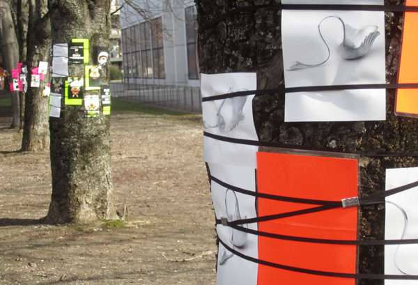
The range of exhibition setups reflects the field’s ongoing negotiation with both its heritage (as an applied art concerned with making wearable, sellable objects) and its other expectations (as a reflective practice producing collectable artistic statements). The following case studies, we felt, stake a clear position regarding exhibition setup.
Constructed Places: My Kingdom and Irony Forest
Aaron Decker
My Kingdom, Tanel Veenre, Kunstgießerei München (Art Foundry Munich)
Irony Forest, Akihiro Ikeyama, Junwon Jung, Mari Iwamoto, Akademie Galerie, U Bahn Station Universtat (Underground Subway Station)
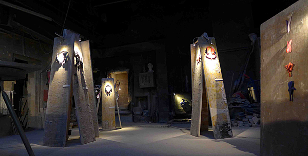
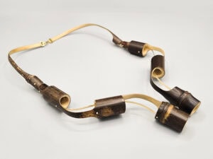
On the table lay a succession of new pieces from Tanel Veenre. Heart motifs were expressed in wooden pipes halved and placed back together, and tuners from a violin merged like a tiny swarm of black butterflies. The hearts were highlighted by a sharply cast light that travelled acutely across the table, not completely illuminating the pieces but begging the eye to get closer and inspect them. These were but a few of many works on display.
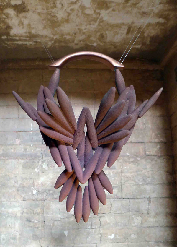
How, I wondered, was this rather stark mise-en-scène influencing my reading of the jewelry? Surely it was dark, mysterious, and there was a sense of energy. Layers and layers of process. Soot covering every inch. The room felt frozen at night. Silent. Like an opera stage without the actors. The pieces themselves became caricatures for me, like aggressive animals peering in the night. Each with a role, a personality, and a voice. But did this space provide additional knowledge about the work? An insight?
Tanel Veenre’s exhibition was one of the most eye-catching shows I viewed during Schmuck. Coincidentally, I left wondering what I had seen. Was it a dramatic background for the work to sit on or an installation that utilizes jewelry as prop? In either case, I noticed a conflict within this show. In the art world at large, there seems to be a trend in constructing an environment, installation, or “experience.” In an object-based art field, especially one in which the objects are presumably destined to be taken out of these setups and worn by their owners, the idea of constructing an environment that overpowers the actual work appears counterintuitive. In fact, using the language of the installation is confusing because installations normally imply that their components are inseparable from the whole. For example, one wouldn’t walk into Gagosian Gallery, point to a corner of an installation, and ask, “How much for that section? I love it, but only that corner.” I would argue the same for jewelry. My Kingdom was a culmination of beautiful work, in fact some of my favorite, yet I was perturbed by the method of display because I couldn’t see the work singing the same song somewhere else. The work sang beautifully on its own; the extravagant display, however, seemed to say it could not and needed the help.
In contrast Irony Forest, an exhibition by Akihiro Ikeyama, Junwon Jung, and Mari Iwamoto in the Akademie Galerie, used the idea of display as commentary or as a supplemental layer to understanding the work without allowing the display methods to take precedence over the jewelry. Viewers walking up the stairs from the subway platform to the gallery were struck by the environment. It is a gallery built underground with one whole wall made from glass panels. It was reminiscent of the spaces in zoos, aquariums, and natural history museums where environments are constructed behind glass panels through which visitors and specimens can see and experience one another.
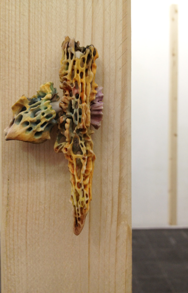
I found myself watching people inside the gallery walk around, exploring the pieces and searching out the work like curious animals smelling out their prey, a brooch. Watching viewers move around inside this terrarium redux, observing them in this minimal forest, gave me a sense of voyeurism.
It seemed that the artists of Irony Forest knew how to show the work, allowing the method of display to speak rather than forcing the display to say any one thing. I felt that if I were to take one of the pieces from this exhibition, the piece would survive as an entity that spoke the language of the exhibit because it was the work that influenced the display and not the other way around.
The Space Speaks: Lunatic Swing and Neuer Schmuck für Götter
Susan Cummins
Lunatic Swing, Attai Chen, Songho Cho, Carina Chitsaz-Shoshtary, Laura Deakin, Melanie Isverding, Emma Price, Kunstarkaden
Neuer Schmuck für Götter, Staatichen Antikensammlungen in arrangement with Galerie Handwerk
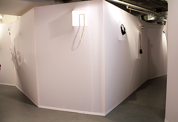
This was the most ambitious constructed environment I saw during my visit to Schmuck 2013. It attempted to change how the viewer interacted with wearable work by changing the room entirely. Attai Chen told me that this space was so unfriendly to jewelry that the group decided they needed to drastically change it and create a less distracting and more intimate environment. They wanted to continue to use pedestals but in a new way, and they certainly managed to do that. But did they take the meaning of jewelry into consideration, or were they just thinking about the room?
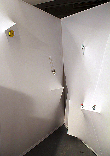
It was clear that a lunatic was lurking in the display, but there was no explanation or way to understand if the jewelry was afflicted by the same craziness. There was no written explanation in the catalogue or in the exhibition space regarding the lunacy, or for that matter, the swinging qualities of the jewelry. Like the display, the title of the show made a forceful statement, but the viewer was left to guess how the two might fit with, or reflect on, the work. Here was a very experimental setup with lots going for it, but it was so out of the ordinary and so extreme that the display attracted more attention than the jewelry. I doubt that was the intended effect.
In contrast to Lunatic Swing’s youthful exuberance, the exhibition Neuer Schmuck für Götter (New Jewelry for the Gods) at the Staatichen Antikensammlungen (State Collection of Antiquities Museum) was a formal and stately affair. Situated in the basement of a museum filled with antiques was work by a star-studded list of art-jewelry immortals, including Robert Baines, Peter Bauhuis, Manfred Bishoff, Bettina Dittlmann, Georg Dobler, David Huycke, Daniel Kruger, Christa Lühtje, Bruno Martinazzi, Francesco Pavan, Dorothea Prühl, Gerd Rothmann, Jacqueline Ryan, Philip Sajet, Bernhard Schobinger, Hubertus von Skal, Tanel Veenre, and Graziano Visintin. New Jewelry for the Gods found its inspiration in a concurrent exhibition of old gold jewelry called The Immortals: Gods of Greece. Its relocation to the museum was the happy outcome of the need for the craft council of Bavaria to find a new space to display their yearly jewelry exhibit while their galleries on Max-Joseph-Strasse were undergoing repairs.

The text mounted on the wall of the exhibition pointed out the addition of artisanal jewelers to the traditional jewelry makers of twentieth-century classics. It discussed the artists’ training and suggested that their work’s merit was not dependent on materials but on “… original artistic ideas, the employment of alternative materials, or socially-related themes.” The very end of the text says that these jewelers have “… a personal involvement with antiquity.” During dinner in a very loud beer hall the last night of Schmuck, curator Wolfgang Lösche stressed that Neuer Schmuck für Götter was all about the relationship of these jewelers to mythology.

One thing I would say the lineup lacked was a strong showing of women immortals, who I believe held their own with the males in mythological times. Four women out of 18 exhibitors. Really? Can’t we at least keep up with the Greeks? I would liked to have seen Tone Vigeland’s chain mail necklaces, Kiff Slemmons Hands of the Heroes, Wendy Ramshaw’s Room of Dreams, Kadri Malk’s Medusa, and many others included.
Some might say that this old-fashioned way of showing jewelry in glass cases in stuffy museums relegates it to some kind of archeological finding. It does. But in this case, the choice of jewelry related to immortals, mythology, and antiquity fit the location at the antiquities museum perfectly. Every space and display strategy has an effect on how we read the jewelry. It adds context and speaks to the jewelry. It is rare, and all the more welcome, to find the two working together so well.
Case Study: Five Men and Aftermath of Art Jewellery
Marthe Le Van
Five Men, Pavel Filip, René Hora, Pavel Opočenský, Martin Pouzar, Jiří Šibor, Tschechisches Zentrum (Czech Center)
Aftermath of Art Jewellery, Sigurd Bronger, Norman Weber, Lisa Walker, Reinhold Ziegler, Stefan Heuser, Runa Vethal Stølen, Eunmi Chun, Ingeborg Resell Elieson, Museum Villa Stuck
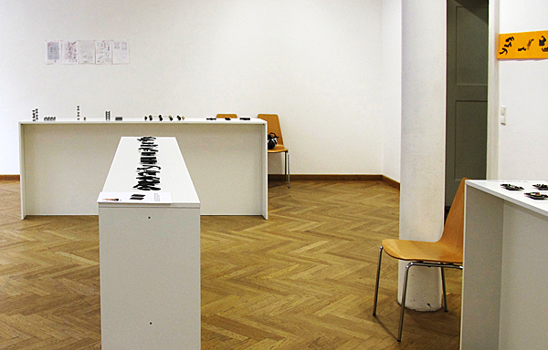
The show’s display was generic. There were five long, low pedestals, one for each artist. Each name was spelled out in vinyl on the pedestal and the wall. Each piece sat centered and equidistant from the next. Nothing was out of line. Why then, did I consider Five Men an ideal setup?
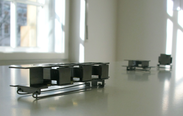
The short and simple answer is that the display made me like the work. Many factors acted in synch to generate this conversion. Some were controllable, and likely intentional, such as the perpendicular placement of a pedestal and the identical width of an aisle. Each artist was presented without bias or flourish. This neutrality freed me to closely examine the work, and more importantly, to become aware of other factors in the room, such as the geometry of shadows and reflections caused by sunlight. These fleeting effects mirrored the forms of the jewelry and changed my perception of it from detached mechanical exercises to authentic manifestations of closely observed surroundings.
Five Men included working sketches by all artists. It was no revelation that such highly engineered jewelry required copious technical drawings. It was a tremendous surprise, however, that each artist’s rendering was executed by hand. These drawings revealed a soulful process absent from the finished pieces.
Martin Pouzar’s brooches resembled miniature high-rises in a public housing project. After looking at them, I looked past them to the multi-paned gallery windows, and then to the imposing office buildings across the street. A brooch by Jiří Šibor closely resembled the bones of the steam radiator behind it.
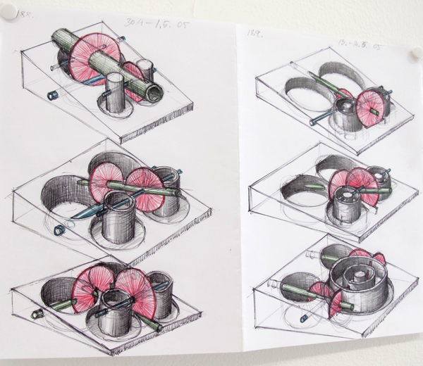
Investigating visual perception is important to both artists. In describing his Schmuck collection Hidden Spaces, Šibor says, “I created brooches that contain more or less visible parts. Initially, we perceive the form of objects, and then discover the shadows and reflections of metal and colored parts, glass or acrylic, which are partially hidden.” In essence, I could say the same about Five Men. Whether intentional or coincidence, the structural correlations between art and site led me to discover the “shadows” or nuance of the jewelry. The modesty of this display influenced how I assessed each Schmuck exhibit from then on.
Museum Villa Stuck, the exhibition site for Aftermath of Art Jewellery, is in many ways the antithesis of the humble Czech center. This grandiose villa-turned-museum was once the residence of art nouveau artist Franz Stuck. Stuck envisioned and realized every detail in his home, from the music salon’s astrological ceiling mural to the drawing room’s golden mosaic wall covering to the placement of his paintings throughout. It is gloriously extravagant.
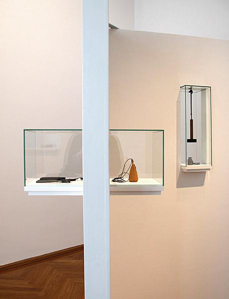
The jewelry was displayed on a succession of detached walls that also set the viewer’s route. I enjoyed the clever installation of the vitrines and shelves directly in, and often through, the walls. This conceit let me see both sides of some of the work. And it looked cool. But as I progressed through the show, the obstacles and shortcomings of this display system became clear.
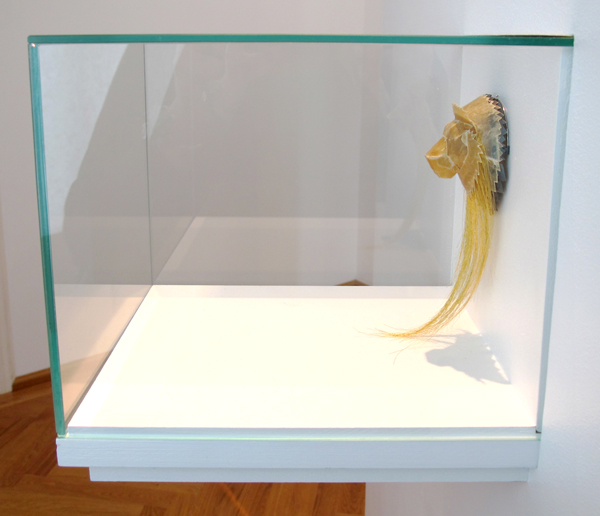
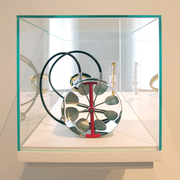
Often, more than one piece sat inside a cube, each oriented to face opposite sides of a single wall. I was grateful when this arrangement allowed me to see the back of a piece, but more often than not it impeded a proper view of the primary work. This visual interference was most noticeable for intricate constructions, such as those by Sigurd Bronger and Norman Weber. The solid forms of Reinhold Ziegler and Stefan Heuser were less affected. Empty wall space was plentiful, verging on disproportionate to the scale of the work and the show. Though additional inset vitrines or pedestals would have been an improvement, they wouldn’t have warmed me to Aftermath at Museum Villa Stuck.
Schmuck 2013 included ambitious installations and apathetic ones. I was driven to distraction by the overwrought art direction in some shows (The Lunatic Swing, Otto Künzli: Die Austellung, Suspended in Pink); offended by the outright neglect of display in others (Manfred Bischoff—Bruno Martinazzi, Karl Fritz: What I Do For You); but each day, often when I least expected it, I experienced a presentation that dutifully, equitably, and even boldly served the jeweler, the jewelry, and the viewer (Five Men, Volker Astrops: Vintage Violence, Still Waters Run Deep, Schmuck You!, Nine Jewelers at the Bowling Alley).
No matter the show or site, my preference is for jewelry to be uncovered and approachable. I want to see it, feel it, and breathe it in. I want to examine how it’s made and try to sense the spirit of the maker. Every once in a while, I want to fall in love. With the jewelry, mind you, not the display.
Takeover Strategies: Vintage Violence and Matadero
Benjamin Lignel
Vintage Violence, Volker Atrops, Zipprich Antiquarian Bookstore
Matadero, Walka Studio (Claudia Betancourt and Nano Pulgar), Café Clara
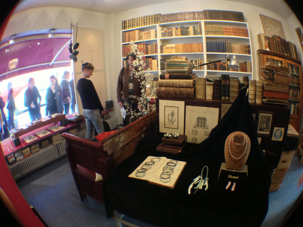
This year’s work on display was assembled from die stamped aluminum parts manufactured by Atrops during a two-week session at an abandoned jewelry factory. Floral motifs, friezes, and abstract punches from the 1950s dapple simple coils, spirals, and torques of stiff metal. His exhibition strategy (if it can be called a strategy) is non-intrusive. Some areas on the store’s shelves and windows are cleared out to make space for the jewelry, which is placed either on books or on secondhand jewelry props. A wide showcase, facing the entrance, has neat rows of books over neat rows of bangles, brooches, and earrings. What does not fit in those areas is dispatched throughout the store in a “place-it-as-you-go-along” sort of way, and you can miss a few pieces that blend too well with their backgrounds. The experience is shop-like. Almost everything is directly accessible, but the nagging impression that things are hidden in plain sight invites prolonged browsing.
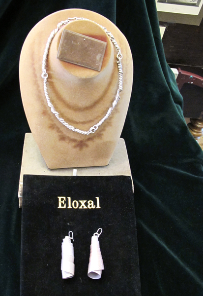
This was my third Atrops’s antique bookstore exhibition. Removing the novelty factor made me less attentive to the surrounding but not more immune to its pervasive charm. It is a comfortable environment, and a subtle osmosis lets the obvious emotional durability of the books imbue the jewelry itself. We assume that it, too, will stand the test of time. The presentation does not try very hard to grab your attention. Atrops is careful not to use props that would feel misplaced or incongruous in the store. (The casual repurposing of things twee into contemporary jewelry defines this series of work. As a result, the vintage props do not seem contrived.) His objects are simply there and soon won’t be. Like seashells, they look like they were left by the last incoming wave and will be washed out by the next one. In short, there is nothing affirmative or monumental in the presentation. Like his work, it exalts minimal and short-lived gestures.
The positive effect this has on me is informed by the context of Munich. In sharp contrast to the far more ambitious setups of some of his peers, Atrops’s no-frills approach casts a simple spell. Favoring a shop-like presentation in a shop (and not, as Künzli, in a museum) and his decision to shun both a spectacular setup (like Tanel Veenre at the foundry) or a more frictional displacement strategy (like Anja Eichler and Gabi Veid at the bowling alley) makes a claim about his practice that is entirely proportioned to his work— “I make simple, evocative, and wearable objects for sale.”
I am not convinced, however, that the work’s sphere of inspiration or its explicit references to sexuality were best enjoyed over latte. Put differently: the attention we pay to our surrounding in eateries will automatically default to “skim and forget.” Force of habit and emotional comfort are to blame. Meanwhile, different art requires an attention of a different kind. Where Atrops’s needs to be browsed, Walka Studio’s demands a more confrontational sort of tête-à-tête in order to let the raw power of the work give a leg-up to the latent narratives it puts in play.
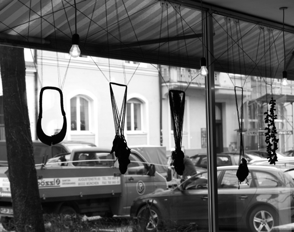
Radically upsetting the cafe’s table layout might have helped. It could have signaled to regular customers that these were not quirky exotica collected to liven up the walls. It would have given Schmuck cognoscenti easier physical and visual access to the work. Stronger mediation (wall texts, full captions, videos) could have provided all with a glimpse of the rich background that informs the duo’s powerful work. Instead, it was business as usual. Pieces were hung where they least disturbed (the window) or tucked away in white boxes behind the tables. They did not interact with the venue in any meaningful way and as a result felt rather decorative.
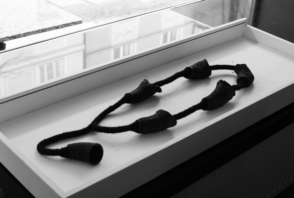
The problem, ultimately, is that the installation did not occupy the space as much as it popped up in it. Unless you specifically went to Café Clara to see the show, you could be forgiven for dismissing the work as someone else’s cup of tea. It is difficult to say whether the non-initiated audience Walka Studio set out to reach was, in fact, lured into their web. This is all the more unfortunate as the work deserves prolonged inspection, and the eat-in could have proved an exciting environment to talk about what we do with dead animals.

