For all their alleged “insularity,” makers in this field are remarkably curious, and invariably compile extensive (mental or actual) visual archives on, well, the world around them. You and I think of it as a way to justify traveling, looking under rocks, poking at fish in market stalls, or chatting up youngsters with weird tats. But people more serious than we use chance encounters with reality to inform their practice and sharpen their thinking: What they contemplate is not always jewelry—and like them, AJF is interested in the wider culture that informs jewelry—but what they think tends to circle back to it.
“Lessons by” brings those insights to AJF’s readership, and will track a small roster of AJF contributors as they look, shoot, and reflect on what they see. Our first guest reporter is Kellie Riggs, who finds inspiration in meeting artists, hearing them talk, and, in one instance, discussing the watch of their dreams.
– Benjamin Lignel
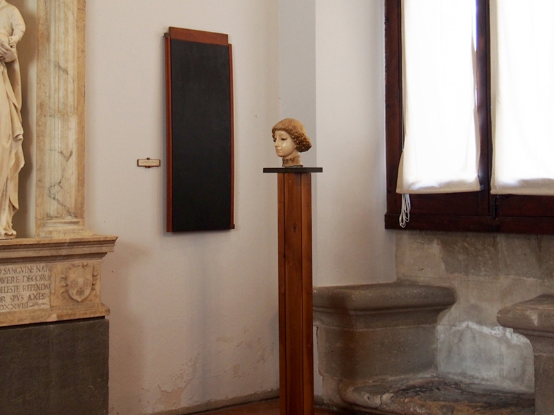
Installation view of Palazzo Abatellis, Palermo, Sicily, Italy
Museum interior and display design by Carlo Scarpa, 1953
Italian architect Carlo Scarpa was asked to renovate the 15th-century Palazzo Abatellis into the Galleria Regionale della Sicilia of medieval art. Quickly, too, but no shortcuts were taken. He had previous experience with designing museum/exhibition spaces, and his attention to detail can be found in every inch of the spacious and luminous Sicilian palace.
Scarpa’s approach was not just a mere redesign of an interior; it was an intervention, far beyond the usual considerations of atmosphere and light. He also responded to the individual need of each object in the collection—at times almost independently of one another—but with the same level of sensitivity and abstraction. The invention came from these needs being prioritized intuitively, focusing on how exactly an object should be displayed while maintaining the space’s authenticity.
Scarpa plays a game of logic, invention, and respect in all of his interventions, big or small: from the inset walls throughout the space that frame certain works and create depth; the vertical mullions of the modern windows placed thoughtfully between the original columns of the Gothic-Catalan windows; the beautifully designed bronze makeshift columns that hold ancient capitals; the colored wall panel that goes around the base of the stairs; even the handmade hinges that pivot certain paintings to an angle off the wall. Pictured is a marble head on a wooden pedestal placed in the corner of a room. A charcoal-colored wood panel is installed on the adjacent wall, providing a nice frame for the sculpture when viewed at the correct vantage point.
Here there is a lesson, and it’s quite simple: when work (of any kind, jewelry included) needs to go into a room, do not stop short. Do what the object asks, respect the space, consider every angle; there is no need to be sloppy.


